redesign sears commercial so customers can order online
The challenge
Builders, and property managers couldn’t shop through Sears Commercial online because it lacked any e-commerce capability.
Customers had to go through their sales rep for every single order
This wasn’t cost effective for Sears or our customers
The site hadn’t been visually updated in years
SC revenue was down 70M and counting from 2012 - 2015
Total active accounts were dwindling from 21,166 - 14,440 over the same period

Joining the team
I took over for a designer who’d taken another gig. The team consisted of:
2 product owners
1 project manager
1 part-time researcher
My responsibilities were:
UX strategy
Research
Visual design
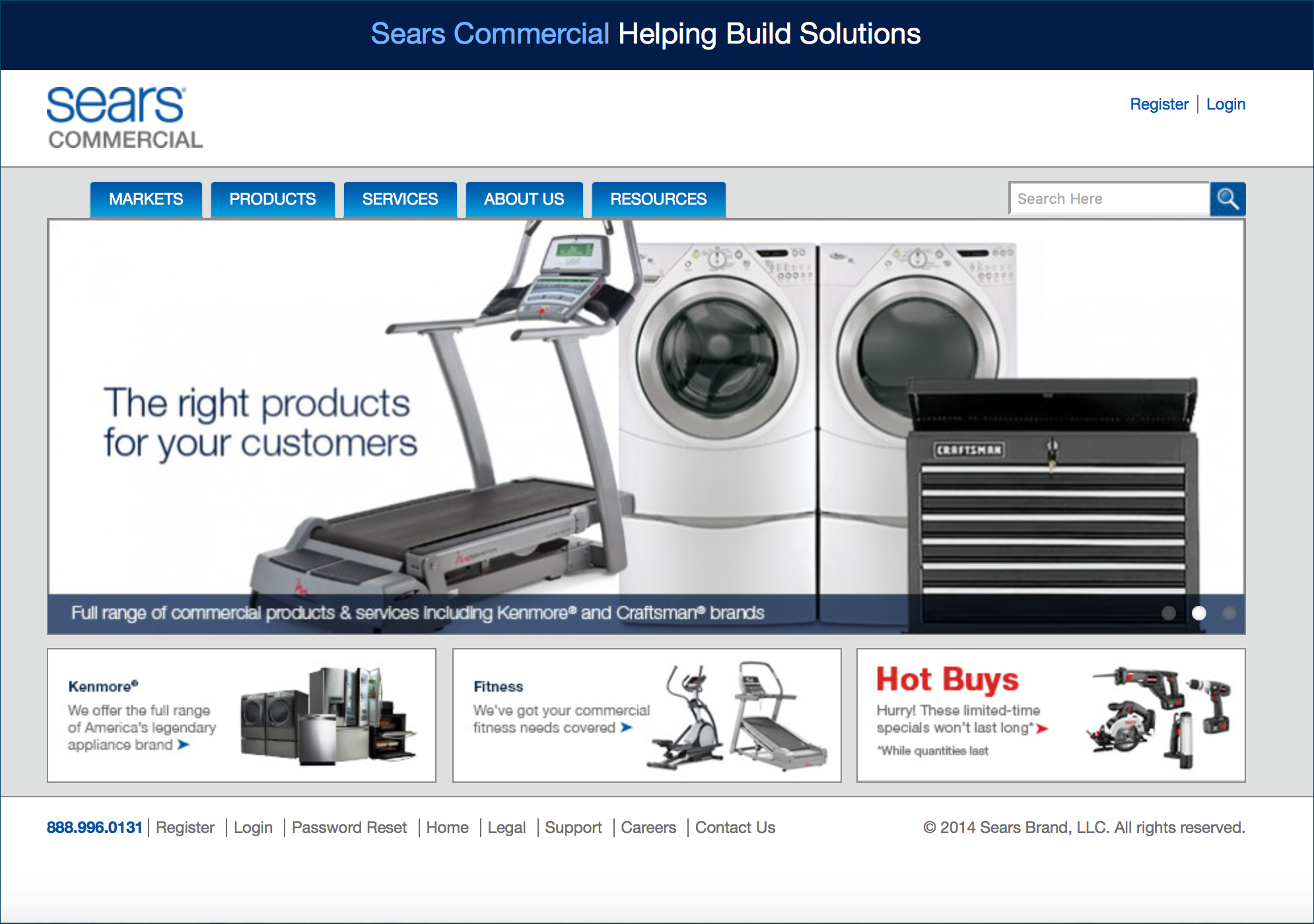
Before
This is Sears Commercial before the redesign. Customers couldn’t shop online, and the visual design hadn’t been updated in years.
Discovery
What had already been done?
User interviews (4 participants)
Historical research (SC performance over time)
What I did
Historical research
More user interviews (2 participants)
Competitive research
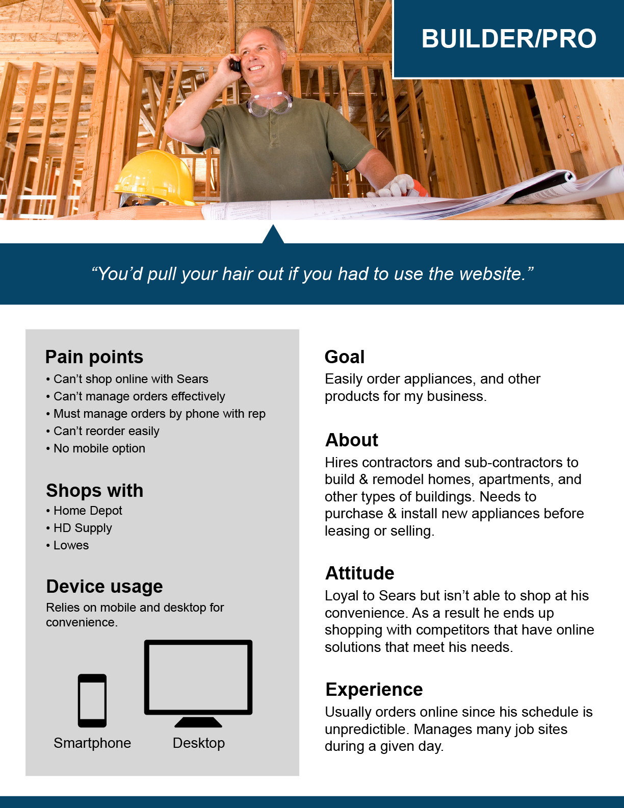
Persona
Content inventory
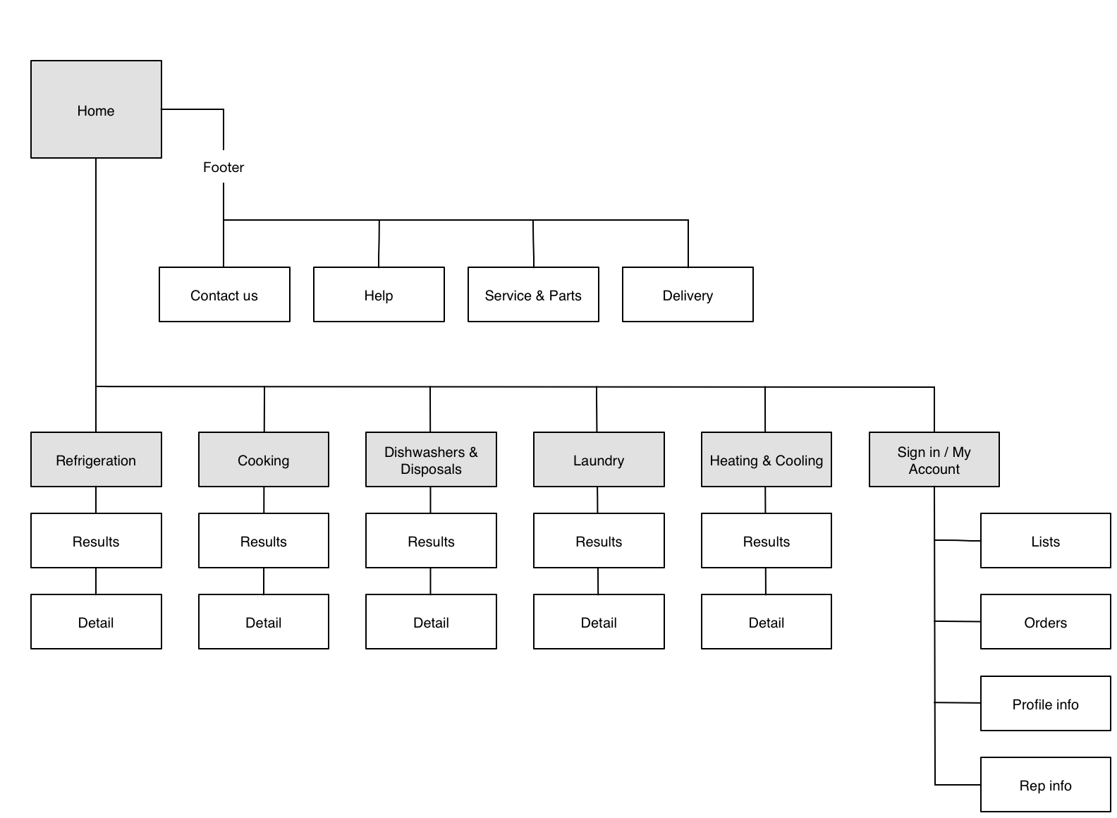
Site map
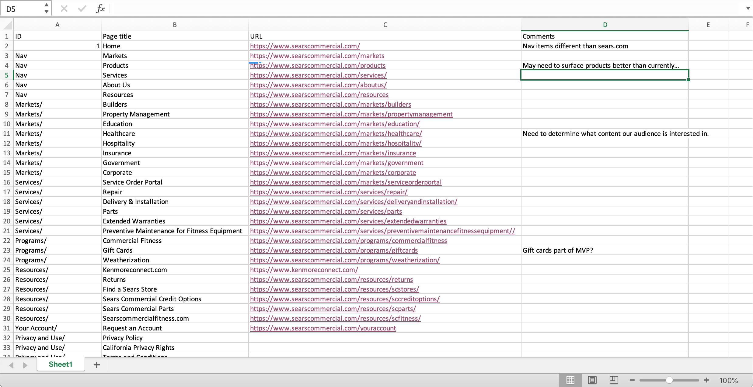
Content inventory
I created a content inventory so we could understand the depth, and breadth of SC products and services. Also compared it to sales data, and user feedback.
Key takeaways
SC customers need a basic, reliable e-commerce experience
Filtering/browsing and viewing product information. Examples - ADA suitability, dimensions, and model number
Fast & easy re-orders is key - most customers reorder the same models for multiple projects
Mobile experience is critical - builders & property managers are often on the go
Customers are willing to pay more if they have guarantees for availability, smooth delivery. Any delays mean their business is losing money
SC customers need to be able to work with their clients to choose a model or package so they need a way to save lists, and share links to product options
Order management is important
MVP
Informed by our research, we decided on a feature set that would allow our loyal Sears Commercial customers to order their appliances online - at their convenience.
Information architecture
I created a site map based on a content inventory of the old site, historical inventory records, and user interviews, understanding it would evolve.
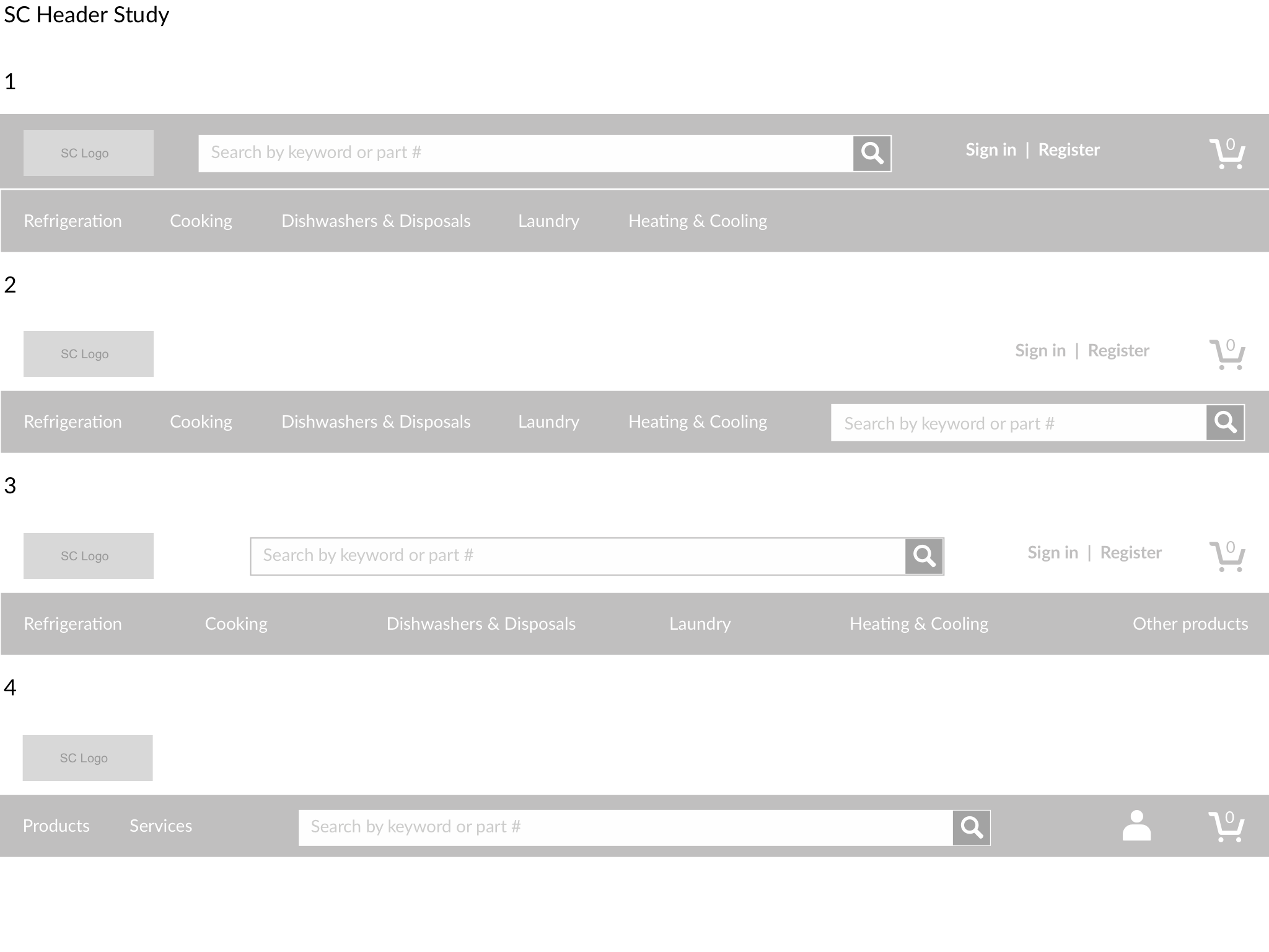
Wireframes
I put together header studies, and wireframes to get consensus from the team, and user input.
into high fidelity
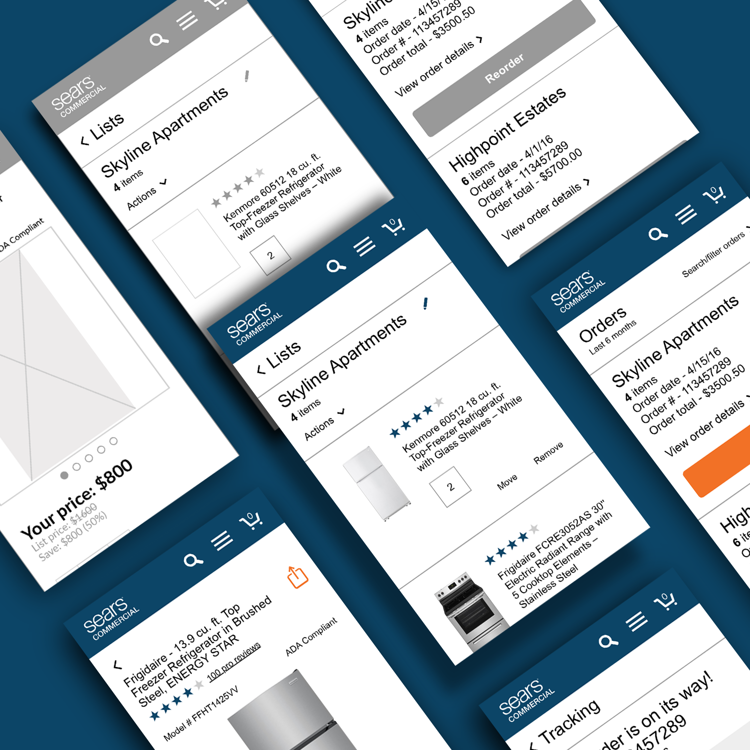
Wireframes rapidly morphed into hi-fidelity mocks. Then I handed off to dev to build as we designed.
Testing as we go
Created click through prototypes for flows to test with users.
New management
Mid-way through the project our 2 product owners were replaced with someone new. It was communicated that the project deadline wouldn’t move to accommodate ramping up the new manager. The new manager seemed to disregard the discovery, and conclusions that our discovery uncovered related to users just needed an e-commerce solution that would allow them to order from Sears Commercial instead of our competitors.
Making our case
My team members and I made a case to the new manager that would put focus back on our initial feature set, and MVP so our customers (who were still loyal to Sears in spite fo the fact that we didn’t have an online solution for them at the time) could order their appliances.
We revisited the discovery research
A lot of work had already been done
Investment in our dev partner
Added in business data
Our users needed an online solution
can’t win them all
In spite of the case made by discovery, user interviews, and other UX artifacts the new manager was unmoved. So the direction was changed, and shortly there after I left the team.
My takeaways
I I’m including this case study to highlight that even in the face of changing priorities, and team members we should always advocate for users. We should also try and find common ground, and work together to achieve our goals.
Sometimes others can’t be persuaded to follow a course suggested by the discovery and research
Advocate for users anyway, even in the face of others who seem to have a different outlook on the research, and user information
Try and find common ground, and collaborate with team members for the good of our users
Feedback
I met with two of the users I’d initially interviewed to get their impressions of the new site that we had developed, and I was encouraged about our decisions based on the feedback.
”This is so much better than the old site!”
”Now I can shop with SC again.”
”It’s pretty basic… No frills.”
Next steps
Conduct user testing
Review analytics against KPIs
Prioritize follow up features